Statistical analysis
Data collection analysis and presentation
Statistical analyses manipulate different types of data. Data can either be categorical or numerical.
Categorical Data
A set of data is said to be categorical if the values or observations belonging to it can be sorted according to category. Examples of categorical data include sex, with categories 'male' and 'female’ and blood group.
Each value is assigned from a set of non-overlapping categories. Categories should be chosen carefully since a bad choice can prejudice the outcome of an investigation. Age group is a type of categorical variable which exemplifies the care needed in choosing categorical variables. Age groups should be chosen carefully so as not to skew results and should not overlap, for example:-
20-29, 30-39, 40-49 Not 20-30, 30-40, 40-50
Categorical data can be either nominal or ordinal.
Nominal Data
The values/observations of nominal data constitute categories that are unordered. A set of data is said to be nominal if the values / observations belonging to it can be assigned a code in the form of a number where the numbers are simply labels. You can count but not order or measure nominal data. For example, in a data set; Males could be coded as 0, females as 1; blood group could be coded as 0, 1,2,3,4 etc.
The fact that they have been coded differently identifies an attribute rather suggesting a relative difference in the data.
Ordinal Data
A set of data is said to be ordinal if the values / observations belonging to it can be ranked (put in order) or have a rating scale attached. You can count and order, but not measure, ordinal data.
The categories for an ordinal set of data have a natural order, for example responses to a questionnaire might fall into five categories:-
Strongly disagree Disagree Neutral Agree Strongly agree
Ordinal variables are often given numerical codes: so in the questionnaire example we might code the response as a number between 1 (strongly disagree) and 5 (strongly agree). However we cannot say that a response of 4 is twice that of 2; calculating an average response is usually meaningless.
Another example of would be classification according to smoking habits, for example:-
Never-smokers Ex-smokers Light smokers Heavy smokers
Categories would need to be clearly defined at the outset before populating a database
Numerical Data
Numerical data is quantitative and arises from measurements or counts. Numerical data can be discrete or continuous.
Discrete Data
A set of data is said to be discrete if the observations belonging to it can only take certain distinct values, usually integers, within a given range. Examples might the number of patients in a doctor’s surgery or number of children in a family. It is not possible to have 673.5 patients on a surgery list.
Continuous data
A set of data is said to be continuous if the values / observations belonging to it may take on any value within a finite or infinite interval. You can count, order and measure continuous data. Examples of continuous data include height, weight, temperature or age. Most continuous data are limited by the accuracy at which measurements can be made, blood pressure will usually be given to the nearest mm of Hg for example but in principle can take any value.
Displaying data
Histogram
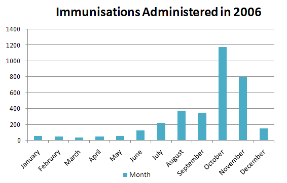
A histogram displays continuous data in ordered columns. Categories are of continuous measure such as time, inches, temperature, etc. The following example (Fig.2) demonstrates immunisations administered throughout the course of a twelve month period in a busy general practice, describing the continuous nature of the data shown.
Fig.2

Frequency Table
A frequency table is a way of summarising a set of data. It is a record of how often each value (or set of values) of the variable in question occurs. It may be enhanced by the addition of percentages that fall into each category. A frequency table is used to summarise categorical nominal, and ordinal data. It may also be used to summarise continuous data once the data set has been divided up into sensible groups.
The following example (Table.6) shows, in tabular form the frequency of a diagnosis of angina in patients registered in practices across a number of areas and the corresponding numbers and percentages taking aspirin.
| Area | Total Patients | % Prevalence of Angina | Number of Patients taking Aspirin | Percentage Compliance |
|---|---|---|---|---|
| 1 | 3360 | 1.7 | 2496 | 74 |
| 2 | 1192 | 3.1 | 812 | 68 |
| 3 | 1051 | 2.2 | 765 | 73 |
| 4 | 1011 | 2.3 | 578 | 57 |
| 5 | 930 | 2 | 731 | 79 |
| 6 | 906 | 1.7 | 750 | 83 |
| 8450 | 2 | 6132 | 73 |
Pie chart
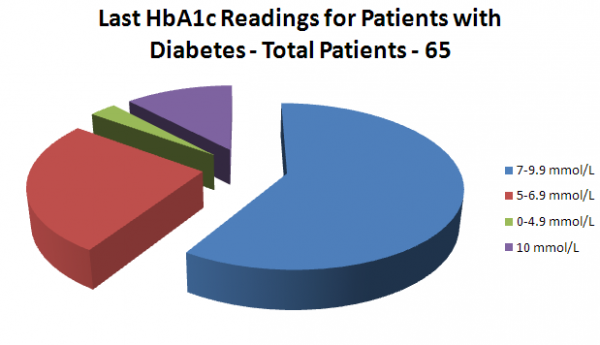
A pie chart is a method of summarising a set of categorical data. It is a circle which is divided into segments. Each segment represents a particular category. The area of each segment is proportional to the number of cases in that category. The following example (fig.3) demonstrates the range and distribution of Hba1C readings of patients in a diabetic clinic. Difficulties may arise when comparing two sets of data.
Fig.3

Bar Chart
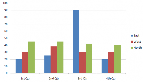
A bar chart is a way of summarising a set of categorical data. It is often used in exploratory data analysis to illustrate the major features of the distribution of the data in a convenient form. It displays the data using a number of rectangles, of the same width, each of which represents a particular category. The length (and hence area) of each rectangle is proportional to the number of cases in the category it represents, for example, age group, religious affiliation.
Bar charts are used to summarise nominal or ordinal data and can be displayed horizontally or vertically and they are usually drawn with a gap between the bars (rectangles), whereas the bars of a histogram are drawn immediately next to each other.

Outlier
An outlier is an observation in a data set which is far removed in value from the others in the data set. It is an unusually large or an unusually small value compared to the others.
An outlier might be the result of an error in measurement, in which case it will distort the interpretation of the data, having undue influence on many summary statistics, for example the mean.
If an outlier is a genuine result, it is important because it might indicate an extreme of behaviour of the process under study. For this reason, all outliers must be examined carefully before embarking on any formal analysis. Outliers should not routinely be removed without further justification.
Sample Mean
The sample mean is an estimator available for estimating the population mean. It is a measure of location, commonly called the average, often symbolised ẍ
Example
Where the data set is: 5 3 54 93 83 22 17 19. The sample mean is calculated by taking the sum of all the data values and dividing by the total number of data values:
Its value depends equally on all of the data which may include outliers. It may not appear representative of the central region for skewed data sets. It is especially useful as being representative of the whole sample for use in subsequent calculations.
Median
The median is the value halfway through an ordered data set, below and above which there are an equal number of data values. For example table 7 shows an odd number of data values (21), the central one being 48 in this instance, see below;
Table.7
|
Data |
96 48 27 72 39 70 7 68 99 36 95 4 6 13 34 74 65 42 28 54 69 |
|
Ordered Data |
4 6 7 13 27 28 34 36 39 42 48 54 65 68 69 70 72 74 95 96 99 |
|
Median |
48, leaving 10 values below and 10 values above |
Where there is an even number of data values, as in table 8 below the median is the point between the two central figures. In this instance there are 20 data values and the two central values are 47 and 49, therefore the median is the point exactly between these two figures ie 48.
Table.8
|
Data |
57 55 85 24 33 49 94 2 8 51 71 30 91 6 47 50 65 43 41 7 |
|
Ordered Data |
2 6 7 8 24 30 33 41 43 47 49 50 51 55 57 65 71 85 91 94 |
|
Median |
Halfway between the two 'middle' data points - in this case |
|
add 47 to 49 and divide by 2 = 48 |
It is generally a good descriptive measure of the location which works well for skewed data or data with outliers. The median is the 0.5 quartile.
Mode
The mode is the most frequently occurring value in a set of discrete data. There can be more than one mode if two or more values are equally common. For example suppose the results of an end of term Statistics exam were distributed as follows:
Student Score: 1..............94 4………90 7……….90
2..............81 5………70 8……….90
3..............56 6………65 9……….30
The mode (most common score) is 90, and the median (middle score) is 81.
Dispersion
The data values in a sample are not all the same. This variation between values is called dispersion. When the dispersion is large, the values are widely scattered; when it is small they are tightly clustered. The width of diagrams such as dot plots, box plots, stem and leaf plots is greater for samples with more dispersion and vice versa. There are several measures of dispersion, the most common being standard deviation. These measures indicate to what degree the individual observations of a data set are dispersed around their mean. For a set of measurements, high precision is associated with low dispersion.
Range
The range of a sample (or a data set) is a measure of the spread or the dispersion of the observations. It is the difference between the largest and the smallest observed value of some quantitative characteristic and is very easy to calculate. Much information is ignored when computing the range as only the largest and smallest data values are considered; the remaining data are ignored. The range value of a data set is greatly influenced by the presence of just one unusually large or small value in the sample (outlier).

